Designing & Developing Micro-Interactions for Northern Trust's Corporate Website
Enhancing a global financial institution's online presence through strategic addition of micro-interactions and transitions.
Project Overview
As a contracted UX designer and developer, I was engaged to enhance Northern Trust's global online presence through strategic addition of micro-interactions and transitions. The initial 6-week project aimed to implement a carefully curated set of animations on the client's public website, with the goal of elevating the brand experience and improving user engagement.
Role and Collaboration
While working primarily independently, I maintained close collaboration with key stakeholders within the organization: Front-End Engineer, Senior UX Designer, and UX Manager. This collaborative approach ensured solid integration of my work into the client's development environment and brand guidelines.
Project Scope and Evolution
The initial engagement focused on:
- Designing and prototyping brand-centric animations
- Coding and implementing these elements into the live website
- Measuring success through brand cohesion and feel
Due to the project's success and ongoing value, the contract was extended multiple times, spanning throughout 2020 and 2021. This allowed for key refinement and expansion.
Impact and Approach
By incorporating these brand-centric elements, we achieved a dual-purpose solution:
- Engaging user attention with key elements
- Reinforcing the brand narrative throughout the user journey
This strategic approach to UX design demonstrated how functionality and branding could be seamlessly merged, resulting in a more holistic and resonant user experience.
Results
Before diving into the process, let's look at some of the results and the reasoning behind them.
Hero Load Sequence
The hero section animation activates upon page load, featuring an interactive line progressively drawn across the page, sequential fade-in of nearby elements, cued by the line animation's left-to-right motion, gradient exposure, and progressive fade-ins. This required custom motion eases crafted specifically for this demo. The sequence concludes by highlighting tiles on the right side of the screen, subtly directing viewer attention.
Revealing Page Elements During Scroll
I developed scroll-based transitions to enhance user engagement utilizing primary design elements and content on the page. Prototyped using HTML, CSS, and GSAP (GreenSock Animation Platform), based on visual designs provided by the client.
Key feature: I ensured these animations are highly flexible by reviewing the existing HTML structure and tailoring the code to it. By appending CSS attributes to design elements you'd like to animate, the elements can be predictably animated without altering existing HTML or CSS structure.
Animated Interactive Vue Component
I created a prototype for a tab-change animation coded with Vue.js and GSAP based on designs provided by the client. I split the hexagonal image into several layers, each containing an individual hexagon. The transitional animations are triggered by clicking the tabs.
I used Vue.js for tab functionality intended as a simple copy/paste solution with CDN reference. Vue was chosen to meet specific technical constraints, and as an opportunity to work with Vue.js.
Key Section Fade-ins
Based on designs provided by the client via Figma, I developed fade-in animations for key sections intended to draw more attention. I cleaned up the provided SVG files for easier programmatic manipulation. Coded with GSAP.js. We explored numerous transition states.
The Process
Project Preparation and Research
Before diving into the design and development of micro-interactions and transitions, I conducted a thorough analysis of the client's brand and market position. This preparatory phase was crucial in ensuring that our animations would align with the client's brand identity and stand out in their competitive landscape.
Brand Immersion
I began by immersing myself in the client's branding materials and their recent website redesign. This process involved identifying key brand principles and important on-site design elements. By highlighting these crucial points, I established a solid foundation for guiding and explaining my subsequent design decisions.
Competitive Analysis
To contextualize our approach, I conducted a comprehensive review of competitors' websites and explored other relevant visual references. This step was vital in helping stakeholders visualize and confirm our intended art direction. The insights gained from this analysis significantly informed and refined the direction of our animation strategy.
Existing Design Audit
I meticulously cataloged on-site design elements, paying particular attention to those with multiple states and transitions. This audit involved listing and video recording these elements to create a comprehensive reference document. By understanding the existing design language, we could ensure that our new animations would integrate and enhance the site's overall aesthetic and functionality.
This preparatory work laid a strong foundation for the project, ensuring that our micro-interactions and transitions would not only enhance user experience but also reinforce the client's brand identity effectively. The documentation created during this phase served as a valuable reference throughout the design and development process, helping to maintain consistency and alignment with the project goals.
Streamlined Delivery Process
Given the client's busy schedule, we adopted a direct approach:
- Developed initial variations
- Narrowed down options
- Presented to stakeholders for feedback
- Refined based on input
- Final presentation to the Director of Marketing
This process ensured efficient communication while allowing for necessary adaptations based on collective feedback.
Prioritization
After completing the initial research and analysis phase, I needed to strategically allocate my design efforts for the upcoming weeks. To achieve this, we conducted a collaborative impact/effort exercise, synthesizing insights from the animation audit and the codebase.
The exercise focused on two key questions:
- Which elements, when animated, would potentially have the most significant impact on user experience?
- Considering the client's technical architecture, how challenging would each element be to implement?
Methodology
We used a visual mapping technique for this exercise. Each design element under consideration was written on a Post-it note. These notes were then placed on an impact/effort matrix, leveraging input from both the design team and front-end engineering.
The horizontal axis represented the implementation effort required, while the vertical axis indicated the potential impact on user experience. This approach allowed us to visually prioritize elements that offered high impact with relatively low implementation effort.
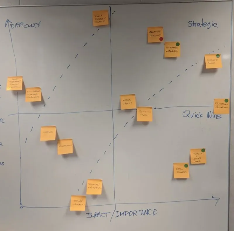
Visual mapping technique showing design elements prioritized by impact vs. effort
Collaborative Decision-Making
The initial mapping was done collaboratively with the core team. This ensured that both creative and technical perspectives were considered in the prioritization process.
To finalize our selections, we presented the mapped matrix to the project director. This step allowed for higher-level strategic input and alignment with overall project goals.
Outcome
This exercise resulted in a clear, prioritized list of animation elements to focus on. It helped us:
- Identify high-impact, lower-effort quick wins
- Recognize potentially challenging implementations that might require additional resources or reconsideration
- Align the team on priorities and expectations for the animation phase of the project
Design Exploration and Refinement
For each selected element, I developed multiple variations, pushing beyond conventional boundaries to fully understand the design space. This approach led to unexpected solutions, such as our final card animation resulting from a CSS code experiment.
Buttons
As frequently interacted elements, buttons required responsive, quick, and elegant animations that balanced branding opportunities with usability.
Cards
I modified the design system to include a hover state, emphasizing copy over imagery to reflect the content hierarchy.
Headers
Large header images required slower transitions to achieve the desired effect without blocking access to content below.
Additional Finalized Animations
Final Card Implementation
The final card hover state increases copy real estate and centrality, creating a more engaging user experience while maintaining brand consistency.
Documentation & Handoff
All design details were recorded in an accessible CodePen for easy transition to the company's official design library. This ensured that the development team could easily implement and maintain the animations going forward.